When was the last time you opened an app and instantly felt, “Yeah, this works”? Not just because it looked good, but because it made sense — every button, every gesture, every tiny detail felt intuitive. That’s the power of good UI/UX design.
In 2025, that power is no longer optional. People are tired of clunky apps, confusing layouts, and endless pop-ups. If your app doesn’t feel smooth, helpful, or personal right away, it’s out deleted within minutes, maybe seconds.
This is especially important for businesses that rely on digital products. Whether you’re building a mobile app, redesigning a website, or launching a SaaS platform, the experience you give users is everything.
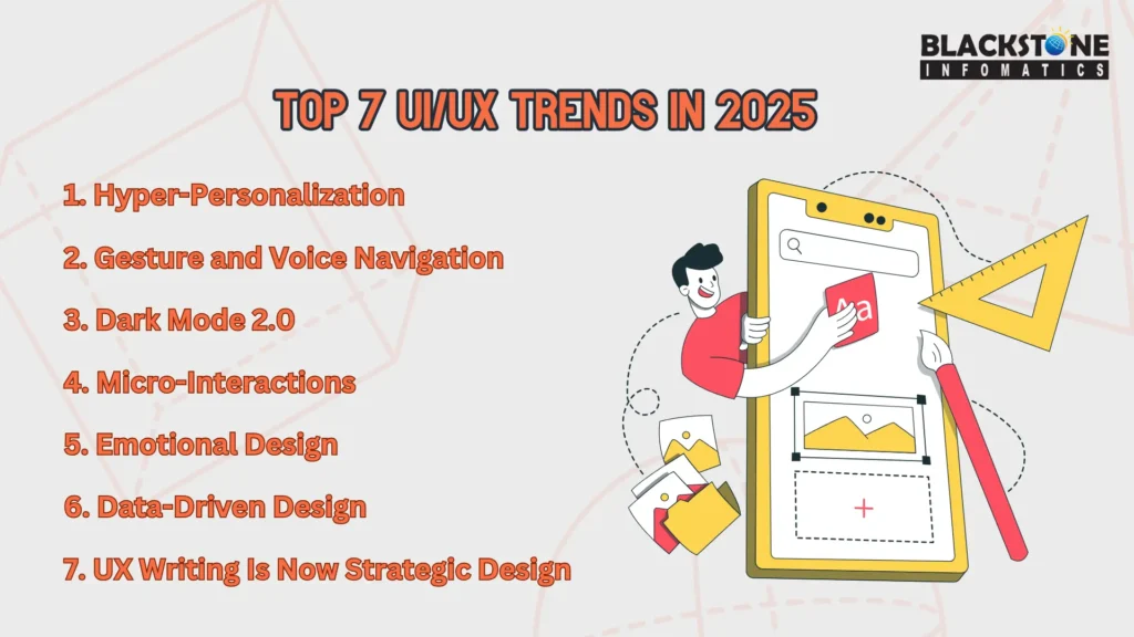
So in this blog, we will break down the top UI/UX trends for 2025.
1. Hyper-Personalization: More Than Just Using Someone’s Name
Let’s start with what users secretly want: apps that understand them.
In 2025, personalization isn’t just about saying “Hi, John!” at the top of the dashboard. It’s about showing the right thing, in the right place, at the right time — without the user having to ask for it.
Apps now use behavioral data to:
- Adjust onboarding flows based on a user’s experience
- Recommend content, layouts, or features based on usage patterns.
- Surface reminders or shortcuts that make sense in context
For example, Spotify dynamically changes its home screen depending on when you log in, and Netflix alters thumbnails to match your taste. These changes aren’t just nice to look at—they increase engagement and reduce drop-offs.
But this shift also affects how we design. Teams that offer UI/UX design services now work more closely with developers and data analysts to shape interfaces that respond in real-time.
Still, transparency matters. Let users know what’s being tracked. Offer opt-outs. Great UX always respects user boundaries.
2. Gesture and Voice Navigation: Designing Beyond the Screen
The way we interact with apps is changing — fast. In 2025, users aren’t always tapping and swiping. Instead, they’re saying things like “mark as read” or using subtle gestures like nodding or tilting to trigger actions.
That’s where gesture and voice navigation step in.
We’re already seeing this in:
- Smart assistants like Google Assistant or Siri
- AR filters on Snapchat and Instagram that react to facial movement
- Fitness wearables where users control interfaces without touching the screen
As a designer or developer, this means one thing: designing for invisible input.
It’s not just about making things cool. This shift is improving accessibility for users who may not rely on visual interfaces at all. For instance, apps that respond to voice commands help users in high-motion environments like driving or cooking, or users with physical disabilities.
But here’s the tricky part — these features need feedback. If someone waves to dismiss a notification, they need a vibration or visual cue to confirm it worked. Good UX doesn’t leave people guessing.
To see how major platforms approach it, check out Google’s official guidelines on gesture-based UI — it’s a great starting point for best practices.
3. Dark Mode 2.0 and Energy-Efficient UI
Dark Mode is no longer just a trend—it’s a user expectation. But in 2025, it’s getting smarter, more intuitive, and far more integrated with the devices people use.
Dark Mode 2.0 adapts dynamically:
- Changes based on the time of day or ambient lighting
- Adjusts contrast for screen types (especially OLED)
- Considers visual comfort to reduce eye strain
But it’s not just about aesthetics. It’s about function. Many mobile apps are now building energy-efficient UI features that actively conserve battery. That means:
- Lighter themes for bright environments, darker ones for night usage
- Reducing heavy animations that tax both CPU and battery
- Offering “lite” modes when the battery is low
For designers and developers, this means thinking more responsibly. Flashy animations and overloaded visuals might impress, but they don’t always serve the user, especially on older devices or in low-power situations.
Apps like X (formerly Twitter) and YouTube already offer auto-switching dark themes. Others go further with battery-conscious design as a core principle. Want to stand out in 2025? Show that your UI isn’t just beautiful—it’s mindful.
4. Micro-Interactions That Guide and Delight
Micro-interactions are those small, seemingly insignificant details that make a huge impact on how users feel when they use your app. They’re not just decorative. They give feedback, set the tone, and make digital experiences feel alive.
Examples include:
- A heart icon that gently pulses when tapped
- A progress bar that smoothly fills with a pop sound
- A subtle nudge animation when you try to swipe the wrong way
But in 2025, micro-interactions go beyond just delight. They teach users how to use your app without long onboarding flows or annoying tooltips.
Take Duolingo. Its playful animations and sounds make each completed lesson feel like a win. Or Google Pay, where the tap and success animations assure users that a payment has gone through.
Well-designed micro-interactions:
- Reduce user confusion
- Reinforce correct actions
- Prevent costly mistakes (like deleting something by accident)
A well-timed animation or haptic response can sometimes replace entire paragraphs of user instruction. It’s about communicating through motion and behavior.
5. Emotional Design: Making Users Feel Seen
A well-designed app isn’t just useful — it makes people feel something. That’s the whole idea behind emotional design. In 2025, UX isn’t about sterile layouts or textbook flows. It’s about building trust, reducing friction, and leaving the user with a feeling, whether that’s calm, joy, relief, or even motivation.
People remember how something made them feel. That’s why apps today:
- Use friendly, conversational language instead of robotic text
- Display small moments of delight (like animations after completing a task)
- Show empathy during error states or loading delays.
Take Slack, for instance. Its loading screens and error messages often come with witty, reassuring copy that softens frustration. Or Notion, where empty spaces don’t feel blank — they feel full of potential.
Empathy mapping, a process where designers map out what a user sees, thinks, and feels at every step, has become central to design strategy.
Designing emotionally doesn’t mean being cheesy. It means understanding what users go through and giving them small, meaningful moments of support along the way.
6. Data-Driven Design That Respects User Boundaries
Modern digital products lean heavily on user data — but in 2025, the emphasis has shifted from “collect more” to “collect smarter.” The goal is no longer just personalization, but trust.
Users are growing more aware of how their data is used. If they sense misuse, they walk away. That’s why successful products today focus on designing around data ethics.
Best practices now include:
- Clear and simple consent flows, not buried in legal jargon
- Purpose-limited data usage tied directly to the app’s value
- Privacy-first defaults, such as opting out by default and requiring opt-ins
- Easy access to privacy dashboards within the app settings
Apps like Signal have built their entire design philosophy around transparency, while others — like DuckDuckGo — earn loyalty by showing users exactly what’s protected. Good UX today isn’t just smooth; it’s accountable.
7. UX Writing Is Now Strategic Design
UX writing used to be something slapped on at the end. In 2025, it’s foundational — a make-or-break component of design that shapes how users interpret and interact with digital interfaces.
Think of every word on the screen as a miniature guidebook. Every label, error message, and call to action shape how intuitive and trustworthy a product feels.
Why it’s now central:
- A good copy prevents confusion by replacing vague labels with precise terms
- The tone of voice differentiates your brand in a crowded app store
- Anticipatory text can reduce support requests and user drop-offs
Consider Notion’s calm, open-ended prompts that reduce intimidation when facing a blank screen. Or Stripe’s clear, no-nonsense payment flows. These aren’t just examples of good writing — they’re good design choices in action.
Bringing UX writers into product planning early means fewer revisions later, more consistency across platforms, and an overall smoother user experience. Words aren’t just helpful — they are the design
Conclusion
Design trends change, but the core goal stays the same: make things that work for people.
In 2025, that means:
- Anticipating needs before users ask
- Communicating through behavior, not clutter
- Respecting privacy while offering personalization
- Making interactions feel intuitive and human
If you’re building digital products this year, pay attention to how design feels, not just how it looks. The difference between a deleted app and a daily habit? Often, it comes down to the details we’ve explored here.
Want to create memorable, high-conversion experiences? Explore our UI/UX design services and let’s build something meaningful.